Commentary: What's in a font? Marco Rubio's malicious change to Times New Roman
Published in Op Eds
My wife and I are once again rewatching “Mad Men,” a show that has, for better or worse, lodged itself deep within my personality. I can’t remember the password to my bank account, or which of my kid’s “Spirit Days” is next Tuesday, but I can endlessly quote “Mad Men.”
We just finished season one, which ends with “The Wheel.” You remember it; the episode where Don Draper pitches Kodak on a campaign for their new slide projector. He muses on the Greek root of nostalgia while a carousel of his family photos advances. It’s perfect television.
But the scene I really love comes a bit earlier in the episode. It’s late at the Sterling Cooper offices and a tightie-whitie-clad Harry Crane clutches his trash can as he drones on about the cave paintings in Lascaux. Crane is corny and sincere, and a too-drunk Don Draper can’t even pretend to listen. Crane holds a hand up to an imaginary cave wall and whispers that it’s as if the artists wished to say, “I was here.”
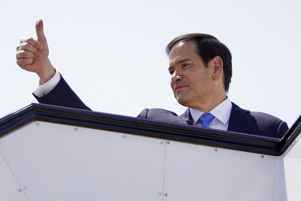
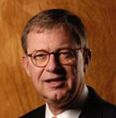
Secretary of State Marco Rubio, like the president he serves, seems similarly determined to make his mark by throwing stuff at the wall. Rubio recently made headlines for insisting that the State Department revert back to its use of Times New Roman as its default typeface, arguing that “consistent formatting strengthens credibility and supports a unified Department identity.”
Rubio has also apparently claimed that Calibri, the typeface adopted by his predecessor, Antony Blinken, was just “another wasteful DEIA program.”
For those not well-versed in the politics of fonts — or, more accurately, typefaces — they generally fall into two buckets: Serifs are laced with the decorative elements of lettering. Times New Roman is famously a serif typeface. Calibri is sans-serif, unadorned and understood to be more accessible because it was designed to be easier to read on computer screens.
I’ll join Calibri’s designer, Lucas de Groot, in calling Rubio’s decision both “sad and hilarious.” It is backwards and hateful for this administration to make such a decision out of spite.
But I’d like to introduce another layer to the conversation.
In the world of design, and in particular of “branding,” any deliberate choice that departs from the default setting helps build brand value. Logo designers meticulously adjust kerning, packaging designers obsess over shades of blue, creative directors insist that documents are built using only approved templates. Whether these choices ever make it to the customer, they contribute to brand equity that tells employees, colleagues and eventually consumers something about what they’re making or selling or building.
Every design program comes with its default settings. I recently learned that Microsoft Word also shifted away from Calibri as its default typeface. But its decision was made for the opposite reasons; Microsoft opted for an even more modern and bespoke sans-serif, Aptos, in the name of accessibility and readability. (Bonus: Aptos is easier for AI to read, too!)
Meanwhile, the default typeface in Google Docs is still Arial, a sans-serif option that’s part of the aptly named “neo-grotesque” style and that I urge everyone to immediately override.
In the early 1930s, a London newspaper upset the industry default by designing and adopting Times New Roman as its typeface, replacing a far more flowery, serif-dripped predecessor. The intention was to modernize with a typeface that was easier to print and easier to read, and so The Times made its decision to communicate the type of newspaper it intended to be.
It’s important to remember that Times New Roman, or any typeface — or any creative choice made by humans! — is not without the context in which it was created. It didn’t just fall out of a coconut tree, after all. Despite it being dull and archaic now, Times New Roman and the decisions that led it were at one time considered modern and forward thinking.
So what is Secretary Rubio’s branding decision telling us about the State Department? That he is plainly, I think, trying to undo — to revert. He wants to “Make America Great Again” after all, and in doing so, rewind to a time when accessibility and readability wasn’t a priority, before governments considered how speech-to-text software could benefit those with disabilities.
In 2025 it would be nice to have a government that prioritized its constituents. That didn’t want its diplomacy couched in serifs, or its offices covered in tacky gold leaf, just because. But that is not our government. And every decision they make, this time a deliberate one, tells us that.
Rubio could at least be applauded for making a decision. The world is brimming with AI-generated slop, and to any creative that is forced to parse briefs written by robots, the default settings and lack of humanity are maddening. We are starved for deliberacy. We relish a typo. Delight in wabi-sabi! Give us the mark of an artist! We are looking for handprints.
Ultimately, I think Marco Rubio is just a malicious narcissist. Like Harry Crane’s imagined cave painters in Lascaux, Rubio wishes to convey “I was here.” Perhaps more sinisterly, he’s trying to undo the long history of other people’s handprints, too. Don Draper would be horrified.
____
Lauren Kaelin is an artist, illustrator and designer living in Brooklyn.
©2025 Los Angeles Times. Visit at latimes.com. Distributed by Tribune Content Agency, LLC.


Comments